


»corporate Design relaunch«
redesign of
logo, print and web
for ↬Knöller
with ↬Fabian Bitter
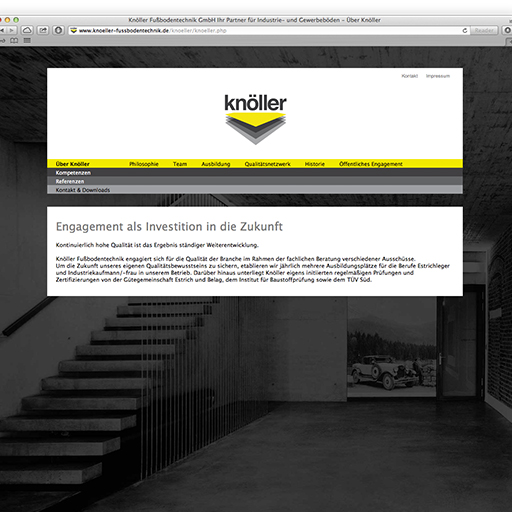
"Knöller Fussbodentechnik GmbH" operates in various industries for designated companies since 1951. The core of operation is to provide holistic solutions for industrial floors from a single source. The long lasting history and clientele speak for themselves, but visuals and communication style did not keep up with the growing product portfolio and scale of work. (↬pic. 2)
The common ground with the client was to rebrand the company in entirety, by distilling skills, product portfolio and values to lay the groundwork for the future.
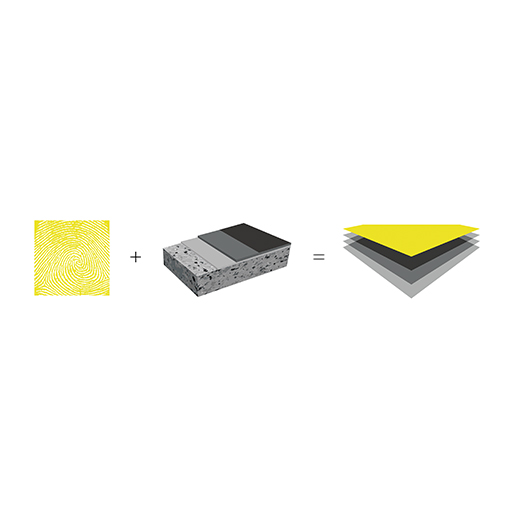
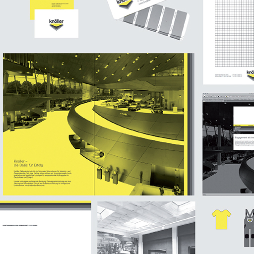
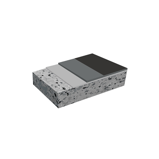
Premise for the visuals were the different layers of industrial floors, which reflect the competences the company provides. The top layer finishes the logo with a carefully picked color and provides the strong crest-like image expected in construction industry. (↬pic. 3)
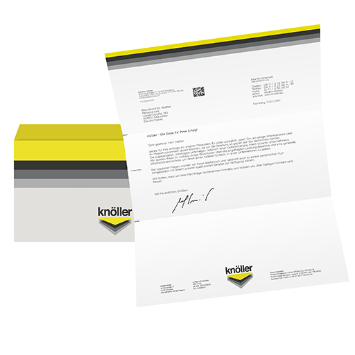
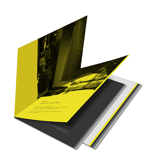
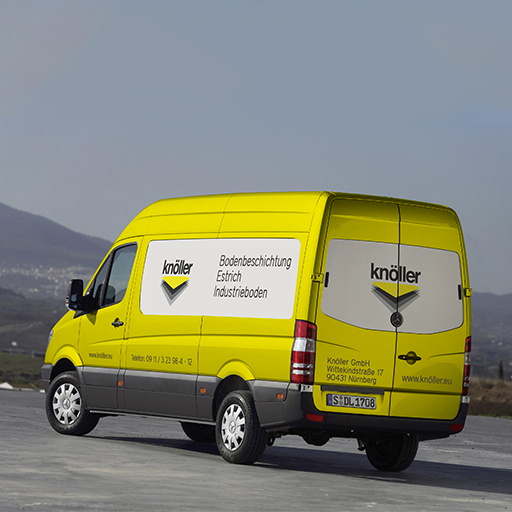
This design philosophy was adapted and applied to all communication material, which range from website to working clothes.